To-do list showdown … revisited!
I did a comparison between Premium Todoist and Premium TickTick a couple years ago just to document some of the differences between these two task list applications and give my opinion or observation of the two. I ended up sticking with Todoist after the showdown just because it fit my workflow better.
A few weeks ago I decided to give TickTick another try just to mix it up a little and see how things might have changed in the past couple years. I didn’t go for a scientific approach or even lay out what specifically I wanted to review. I just used both apps, side by side, for about a month. Whenever I noticed a difference or something that bothered me, I wrote it down. I’ve tried to put those notes into a more cohesive review here; but keep in mind this is culled from a huge page of random notes I took throughout the test. As with last time, I used the premium subscription versions of both of these applications on both my Android phone (with the latest software) and the web version (using the latest version of Chrome).
Task Creation
No real change since last time. Both apps allow you to quickly and easily add tasks with a shortcut key on the web, long-press action on Android, and a hovering “+” button inside both Android apps.
Note that both apps will default to adding the task to whichever project or list you are currently viewing.
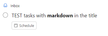
Todoist allows you to use Markdown in both tasks and task comments. Not ground-breaking, but a nice way to make certain tasks really stand out if you want and add some formatting to otherwise plain text.
Due Dates
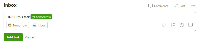
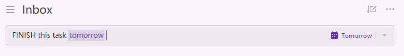
Nothing new here either. Both have great smart date parsing. Just add “monday”, “next week”, “every three days”, or just about any time/date based words and the apps will turn that natural language into an actual due date. Don’t want the due date? Just tap or click the parsed text and it will revert to plain text.
Todoist still has an extra feature with an “every!” option for recurring tasks. I never use it, but it is a handy feature. Essentially it will let you slip the next due date. If something is due in two days but you don’t get to it until the third day, the next occurrence will be two days after the date you actually completed the task. Again, I don’t really use it, but it’s an extra feature available in Todoist only.
TickTick had a bug once in which part of the text of the task had “mon” in the word and it tried to smart parse “Monday” as the due date. I clicked the parsing to make it go away but when I viewed the task later it still had a Monday due date. I haven’t seen it since, so likely a glitch or they fixed it in an update.
Tags and Labels
Not any changes that I’ve noticed in tags and labels. Both are handled the same way, both powerful, both easy to use.
I did notice if I wanted to change a label or tag, TickTick has a small “x” in the task view that makes it easy to delete. Todoist forces me to edit the task and manually delete the tag or open the task card, click the label icon and select or de-select; adding extra steps.
Custom Lists and Filters
Todoist is still king of the custom filters. During my last review, TickTick didn’t have a “NOT” option (i.e., this priority AND not that list). They have thankfully added that functionality, but it is still limited. You’re forced to use their “Advanced” custom list builder which has the features most people will need. Todoist’s custom filters do require a steeper learning curve but are essentially limitless in what you could filter (see my notes about “sections” below for more info).
Subtasks
Not really any change I could see. I don’t regularly use subtasks, so I didn’t delve much into it. I did notice in user forums a lot of the same complaints with Todoist’s subtasks and recurring deadlines. If subtasks are your jam, you’ll probably be happier with TickTick. If you want ultimate flexibility with “unlimited” levels of subtasks, but with some label and due date trade-offs, Todoist will serve you better.
Web Version
I spent 80-90% of my time in the web view of both tools simply because that fits my workflow best. There were a couple things I noticed that might influence your decision.
At the top of the left-hand navigation there are some key differences. In Todoist you will ALWAYS see Inbox, Today, Upcoming … even if you don’t want to or won’t use them. TickTick lets you hide or show just about any of it’s built-in tools.
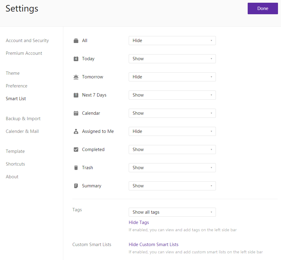
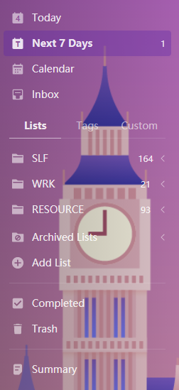
However, Todoist is much easier to navigate on the “left menu” because it stacks the sections (Projects, Labels, Filters) so you can expand or collapse what you want to see. This gives you the option to navigate to everything more easily. TickTick hides each of those sections behind a tab so you will only ever see one section at a time.
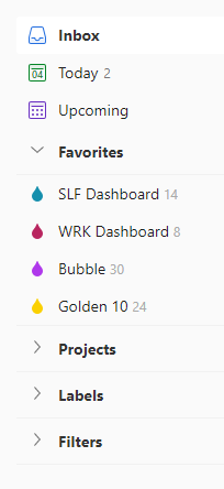
Todoist also allows you to “favorite” any Project, Label, or Filter so it always shows up at the top of the list. This has become a crucial part of my workflow since I can keep my go-to lists or labels always within reach.
As far as usability, Todoist seems more suited to keyboard use and shortcuts while TickTick seems more suited to mouse and keyboard (more things in TickTick seem to be clicky or need to be clicked to interface with them). The reality is probably that they’re both equally suited to keyboard shortcuts AND mouse use … but I’m so used to Todoist’s shortcuts that TickTick wasn’t as intuitive.
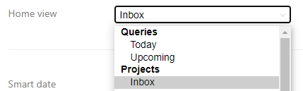
Finally, Todoist allows you to set your “start” page to any query, project, label, or filter you have. TickTick appears to default to the last page, list, or tag you visited.
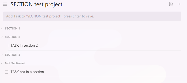
Sections
A new addition since my last review is sections. Both apps have them now. They serve two purposes: you can use them to break down projects into similar tasks or groupings, or you can view the project in board (or Kanban) view; in which each section and its related tasks become a separate column. They’re essentially identical in both applications so there isn’t much to compare.
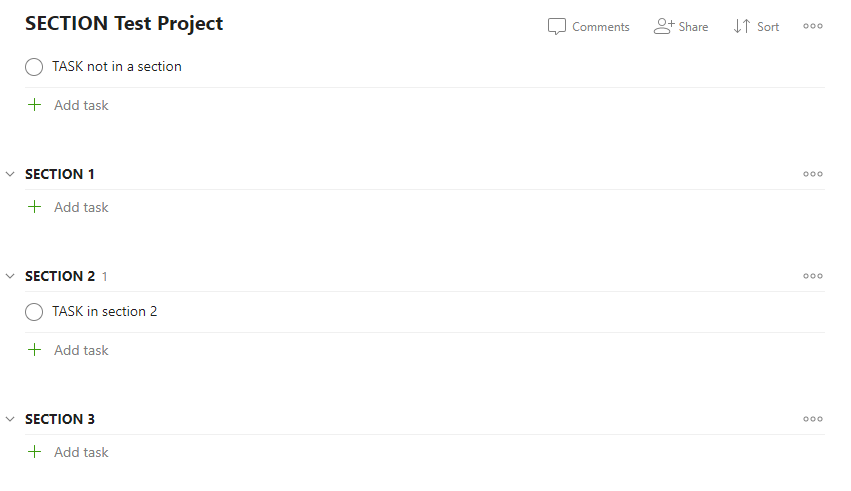
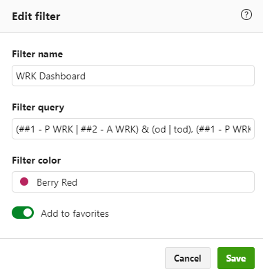
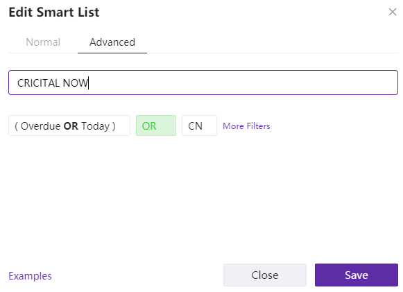
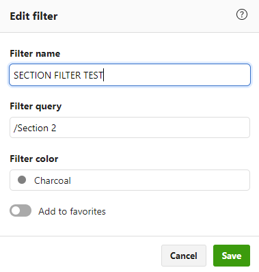
Where Todoist has the edge though is the ability to search specific sections in custom lists. You can show tasks from a specific section or sections; across lists and projects or from specific lists and projects. A great use-case for this would be having the same sections across projects (To Do, Doing, and Done sections) and then search for all tasks in the “Doing” sections across all projects. The sample image below will show all tasks in any project which has a section with the title “Section 2”. Let me know in the comments if you want to learn more about this and I can expand.
GMail Plugin
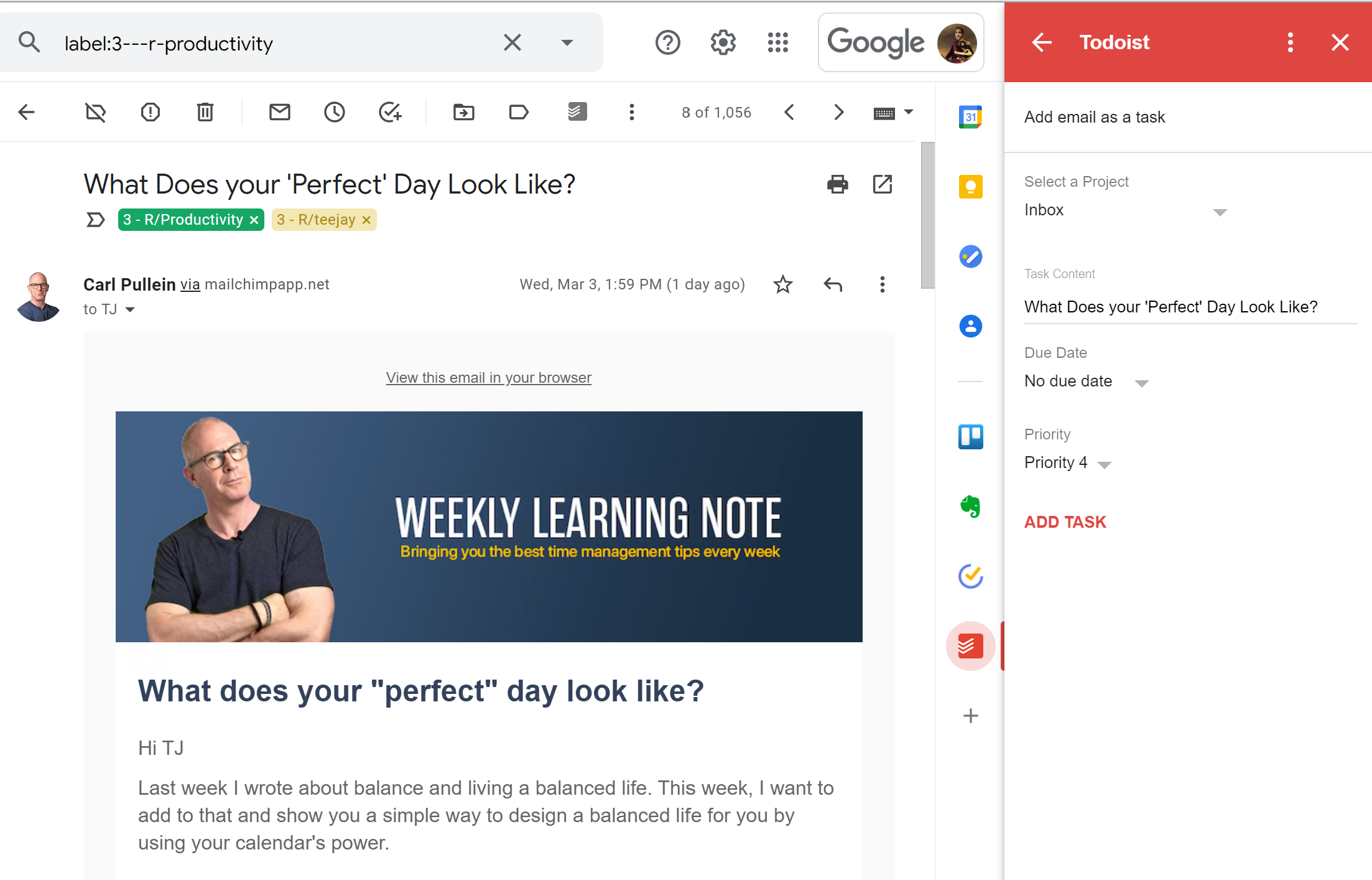
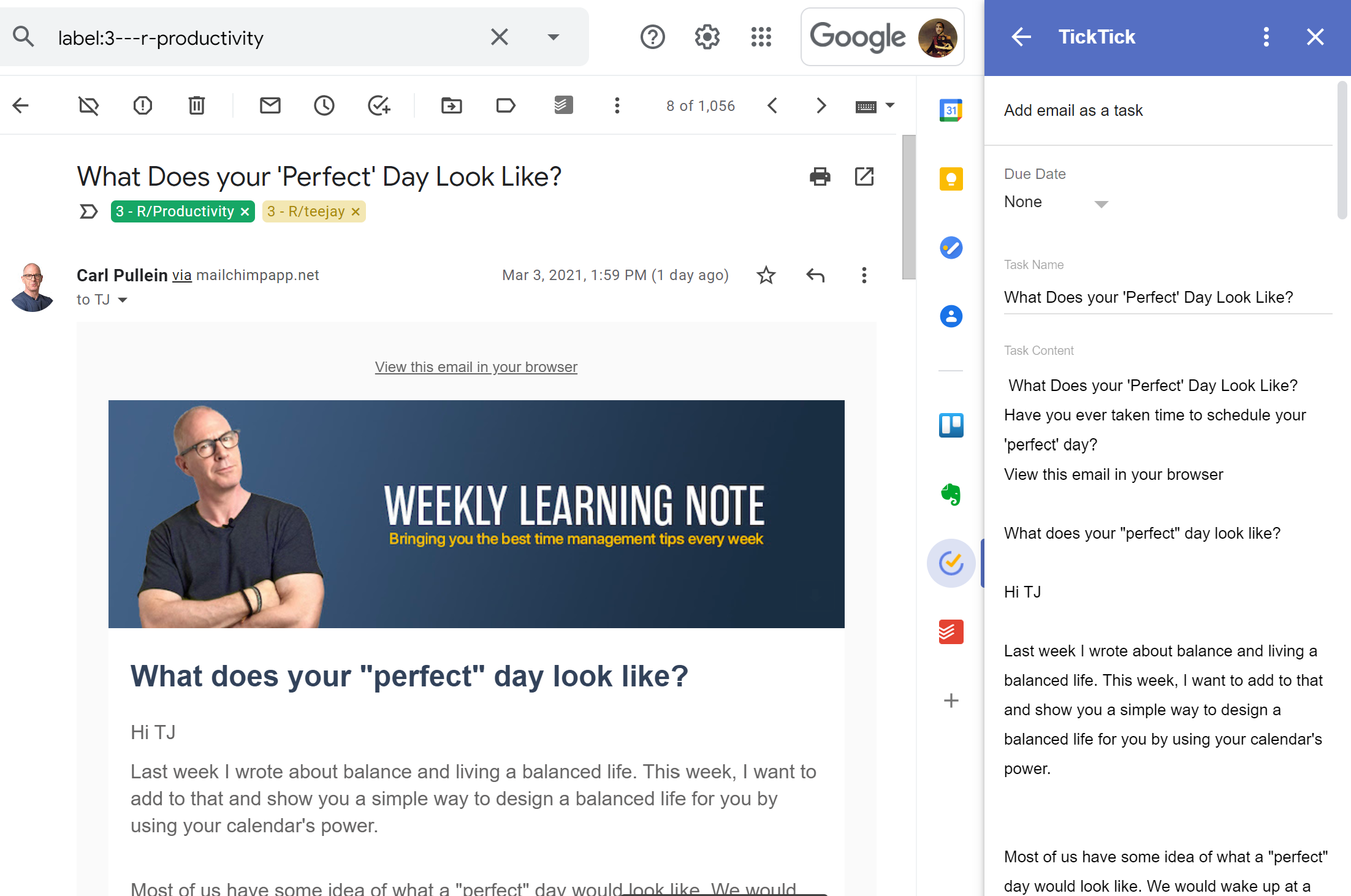
I regularly use the GMail plugin so I can capture tasks directly from email, then archive the email and get it out of my inbox. Both apps have plugins available for GMail which worked the same in browser or Android. This is an extremely handy feature if you want to keep your inbox clean; I recommend you do NOT use your email inbox as a task manager.
I did have a strange bug in TickTick using the GMail plugin every once in a while. If I turned an email into a task with no due date in GMail, when I viewed it in TickTick it would have a due date. It wasn’t smart parsing and I made sure to have “none” selected for Due Date in the plugin, but every once in a while it would randomly assign a date anyway. Not easy to produce and not regular enough to really bother me.
The thing that did bother me though was that TickTick puts the entire text of the email in the comments of the task. For many of the emails I was converting, I had to scroll a long way down the list to get to the “add task” button in the plugin. Todoist creates a link to the GMail item rather than importing all the text.
Android
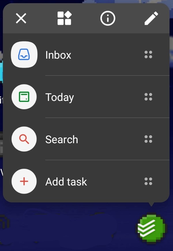
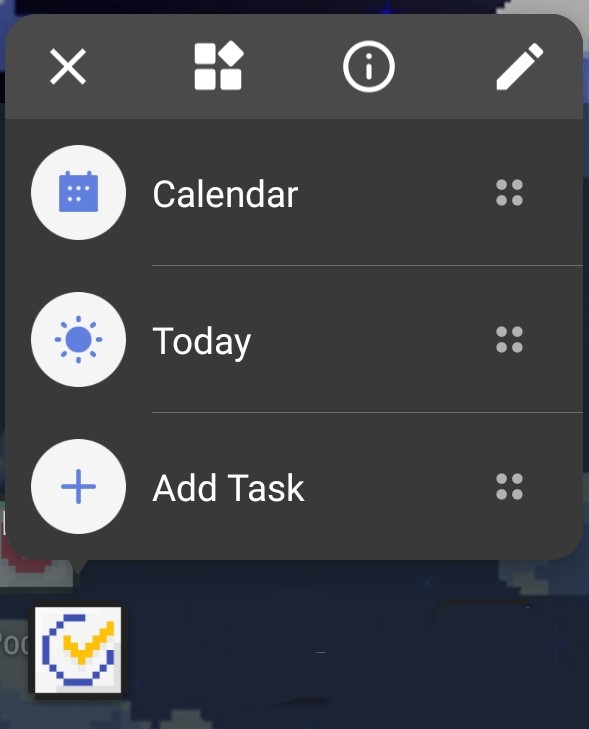
Both apps have a long-press function with the ability to add tasks without having to open the app. The long-press menu for Todoist has options to open the Inbox, Today screen, search, or add a task. The TickTick long-press menu has options for the calendar, Today screen, or add a task.
One thing I appreciate with Todoist when using the long-press “Add Task” popup in Android is that I can quickly add multiple tasks or note to my inbox. The long-press “Add task” window remains persistent after adding a task until I close it. The TickTick popup goes away forcing another long-press. This won’t matter to most people, but I find myself thinking of two or three things to add at once to my Inbox with that long-press “Add Task” popup.
Statistics and Metrics
Just like my last review, TickTick just does this better. Todoist has made some improvements and made it easier to view your accomplishments. However, TickTick has a full on reporting capability to show specific lists, date ranges, etc. and then export that output.
TickTick lets you choose lists or tags to display, date range, group by completion status, date, etc. and how much detail for each task to display. You can see there are also a number of tools available above the report so you can format it however you want then copy or export to PDF, image, or email.
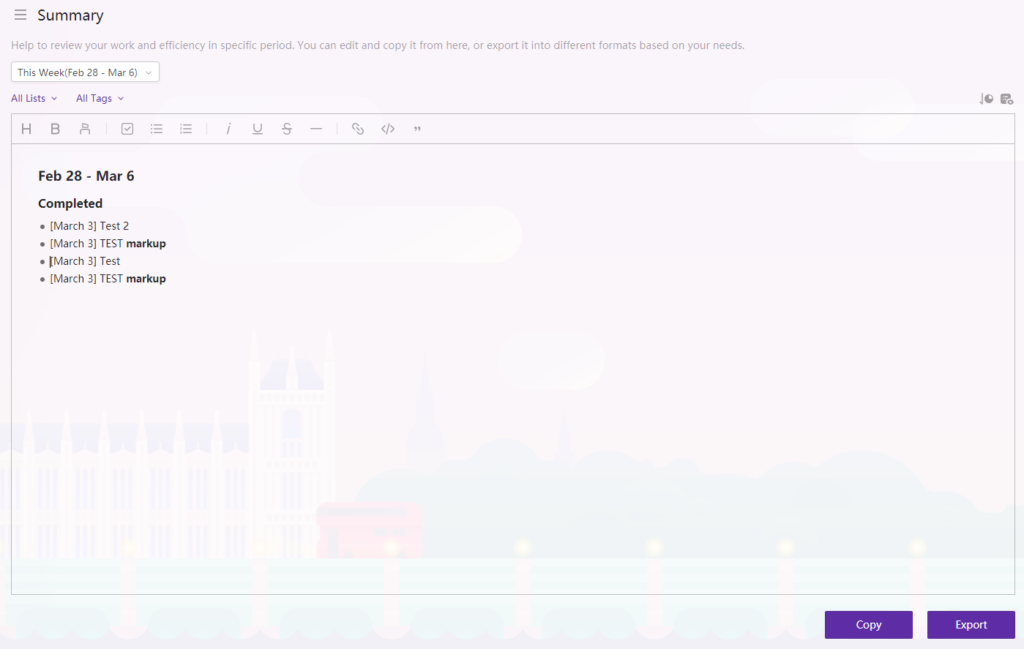
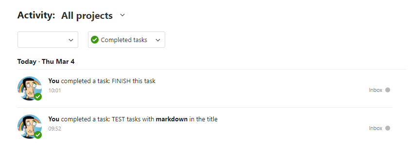
Todoist lets you see which tasks have been completed across which projects. That’s it. Boo.
Other Rants and Raves
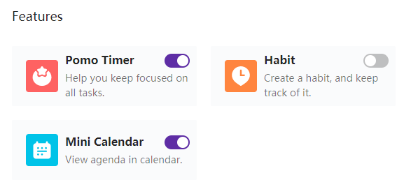
TickTick has more built-in tools to turn it into an all-in-one productivity hub. Pomodoro timers, habit trackers, mini calendar view, the ability to set completion percentage of tasks, etc. Some very handy little tools that I just don’t find myself using, but I see a lot of folks on the forums who love those tools.
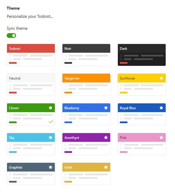
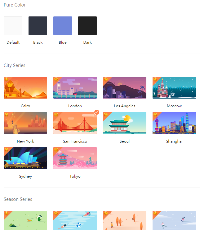
I really like TickTick’s themes too. Todoist has the minimalist theme going for it, which does look nice. But I prefer TickTick’s background images to Todoist’s colored bar. I wish I could customize Todoist’s title bar with an image or something other than one of their chosen colors.
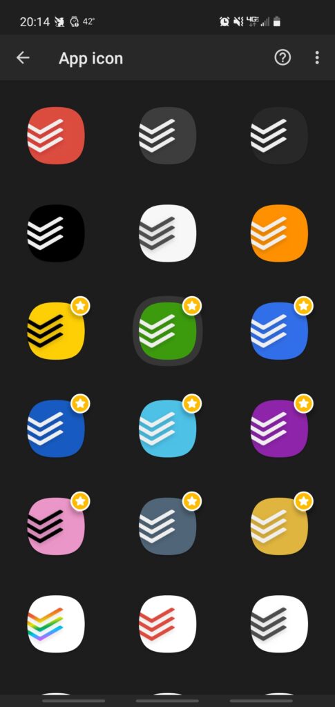
Todoist has recently built-in the ability to choose your Android icon color. That’s kind of a fun little feature. Maybe that means more theme customization is coming. It’s sort of moot to me because I use custom icons on my Android, but still a nice touch.
Conclusion
There are some things that work better for one person over another, which is why it’s nice to have options. Some people really care about powerful custom filters or unlimited project levels and task levels, so Todoist is a better fit. Some people really want built-in productivity features or powerful reporting capabilities, and TickTick ends up being a better choice.
The bottom line is that you can’t go wrong with either of these tools to manage tasks, projects, lists, etc. If you really can’t decide after reading this or watching some comparison videos on YouTube, then I suggest plunking down US$3 for a month of each (US$6 total) and give them a whirl. I bet you’ll know within a couple days which works better for you and captures your interest.
I’ve decided to stick with Todoist because even though both apps have the features I need, the stuff I like better in TickTick isn’t enough draw to leave Todoist, change my whole workflow, get used to a new app, new integrations, etc. If you do end up purchasing a Todoist Premium subscription, use my referral link and we’ll both get a couple months free.
This comparison blog was just meant to review the features of two helpful tools. However, don’t rely on a tool to help you get things done or be productive. Build your system and your process, then find the tool that facilitates that system and process.